Role
Full stack UX/UI Designer
Type
Duration
2-week
01
Problem statement
Most kids grow up using money—but never learn how to manage it.
Parents want to teach their children financial wisdom, but existing tools are boring, adult-focused, or too complex. Schools don’t teach it, and YouTube isn’t a trusted educator.
Black Pebbles set out to fix this with engaging, age-appropriate money lessons. But they needed a website that could quickly build trust with parents and convert curiosity into demo calls.
02
Understanding the Parent Mindset
Parents visiting the site aren’t looking for curriculum PDFs—they’re looking for trust. They want to know:
Is this platform safe, smart, and credible?
Will my child actually learn something useful?
Is this worth my money?
We used real parent feedback to validate our design tone—trust-building, real-world, and emotionally relatable.

From that insight, the design strategy focused on:
Reducing skepticism through testimonials, stats, and a clear founder voice
Creating emotional pull with empowering headlines and relatable examples
Leading with clarity, not clutter—so visitors don’t bounce from overwhelm
03
Research
Even though Black Pebbles is designed for kids and teens, the actual decision-makers visiting the website are parents. That meant the design, tone, and structure had to speak their language—while still hinting at the playfulness their kids would experience inside the platform.
3 core insights that shaped the design:

Parents make fast decisions
The homepage needed to earn trust in under 30 seconds—visually and emotionally.
They want proof, not promises
Testimonials, stats, and clearly explained kits/courses were non-negotiables.They scan, not scroll
Layouts had to be skimmable, chunked into strong headlines and cards—not big text blocks.
Most platforms looked too academic or too gimmicky.


Most parents turn to YouTube videos, free worksheets, or DIY blogs to teach their kids about money. And sure—it’s free, fast, and everywhere.
But here’s the problem:
YouTube isn’t structured learning
Kids binge unrelated videos with no clear roadmap or concept progression.No age-appropriate context
Try explaining compound interest to a 9-year-old using a stock market tutorial—good luck.Zero feedback loops
There’s no way to measure if kids understood anything, or if they’re just watching passively.It’s not built for behavior change
Real financial wisdom is about doing, not just watching. YouTube can’t provide guided tasks, reflection prompts, or habit tracking.

What Black Pebbles Does Differently:
Combines short lessons with hands-on exercises and self-evaluation tools
Offers psychology-backed, age-specific content
Gives parents a clear view of what their child is learning—and why it matters
Key pain-points

From the Parent’s Side:
Too many edtech scams: Hard to trust what’s legit.
Dry content overload: Most “finance for kids” platforms feel like school all over again.
Unclear value: Parents don’t want to dig through PDFs to understand what they’re paying for.
No proof of results: “Will my child actually learn something real?”

From the Founder’s Side:
Low conversion: Visitors dropped off without booking a call.
Messaging overload: The previous layout didn’t clearly show the difference between kits, courses, and workshops.
No urgency or trust triggers: Needed testimonials, stats, and pricing psychology to close interest fast.
04
The site needed to convert curious parents into confident leads—fast. So I approached the layout like a narrative funnel: guiding them from emotional hook to action without friction.

05
To keep things fast and focused, I’m showcasing only the key sections of the Black Pebbles website that demonstrate strategic design thinking and parent-first UX decisions.
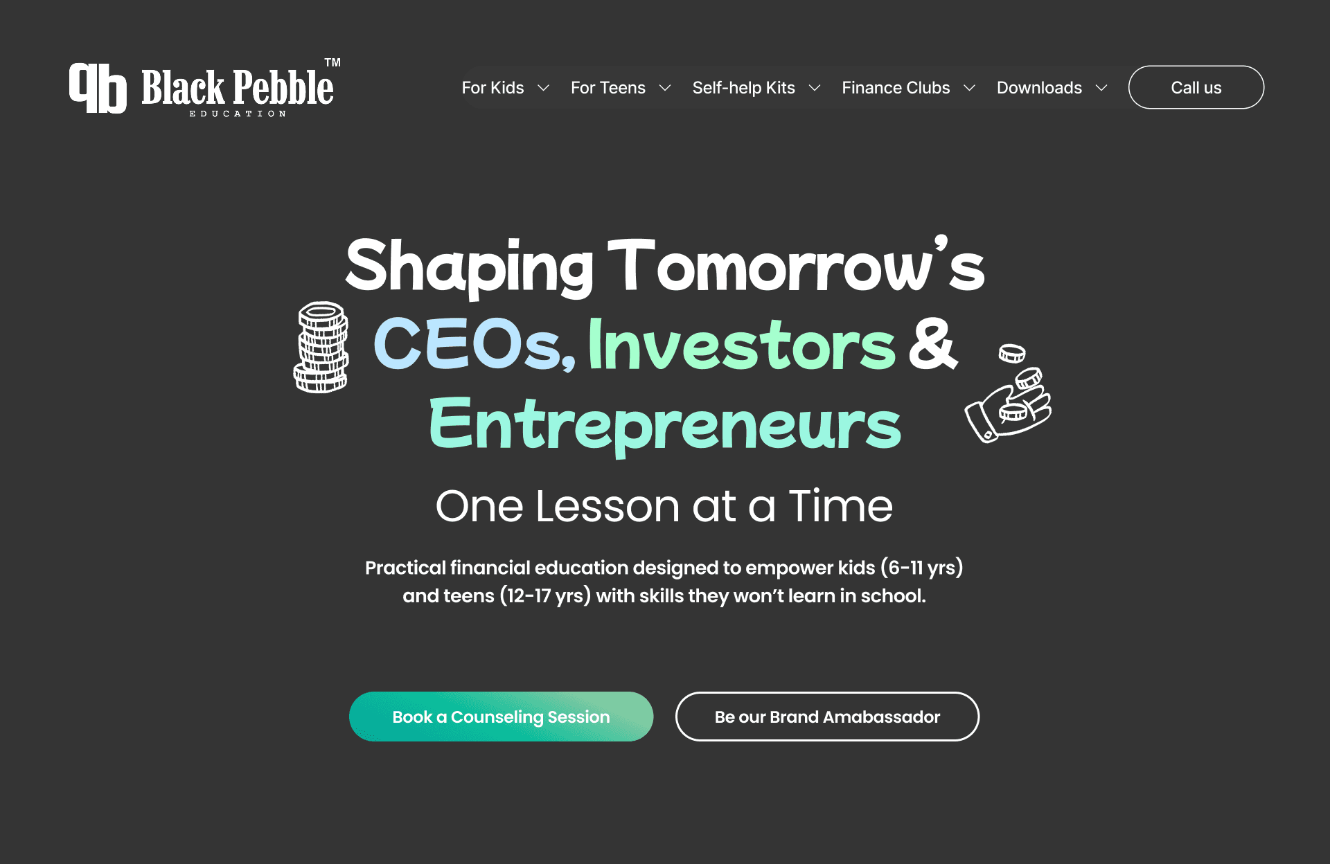
Hero Section
Goal: Capture attention, build trust instantly
Design Move:
Used an aspirational headline (“Raising Tomorrow’s CEOs…”) paired with a hard-hitting stat (74% of teens lack confidence in financial literacy) to emotionally hook parents within seconds of landing.
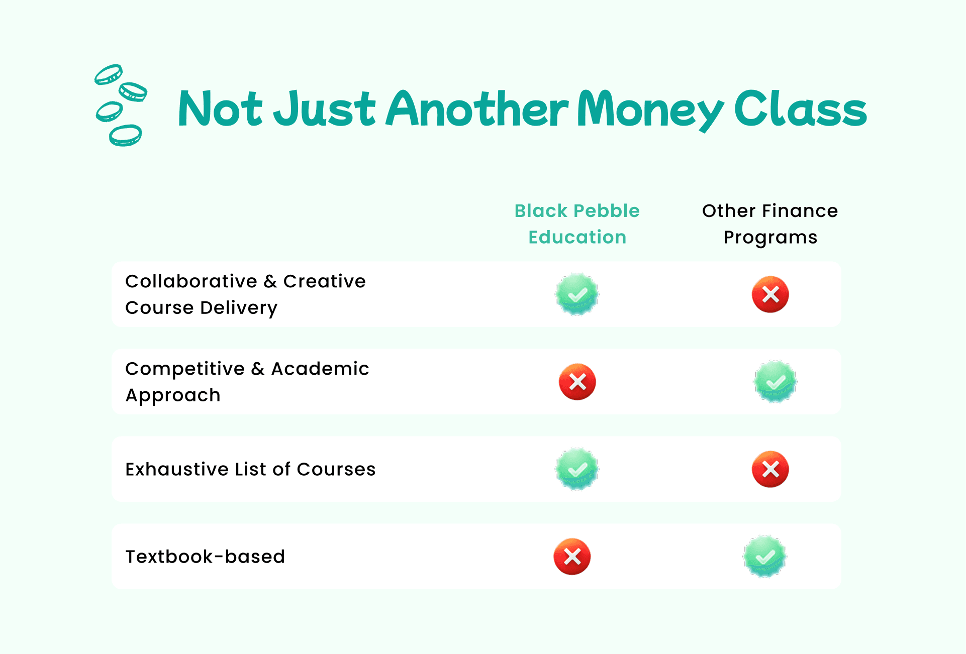
What Others Teach vs. What We Teach
Goal: Show differentiation clearly
Design Move:
Created a simple side-by-side card comparison to show how Black Pebbles covers real-world money skills—not just textbook terms—helping parents immediately see the value.
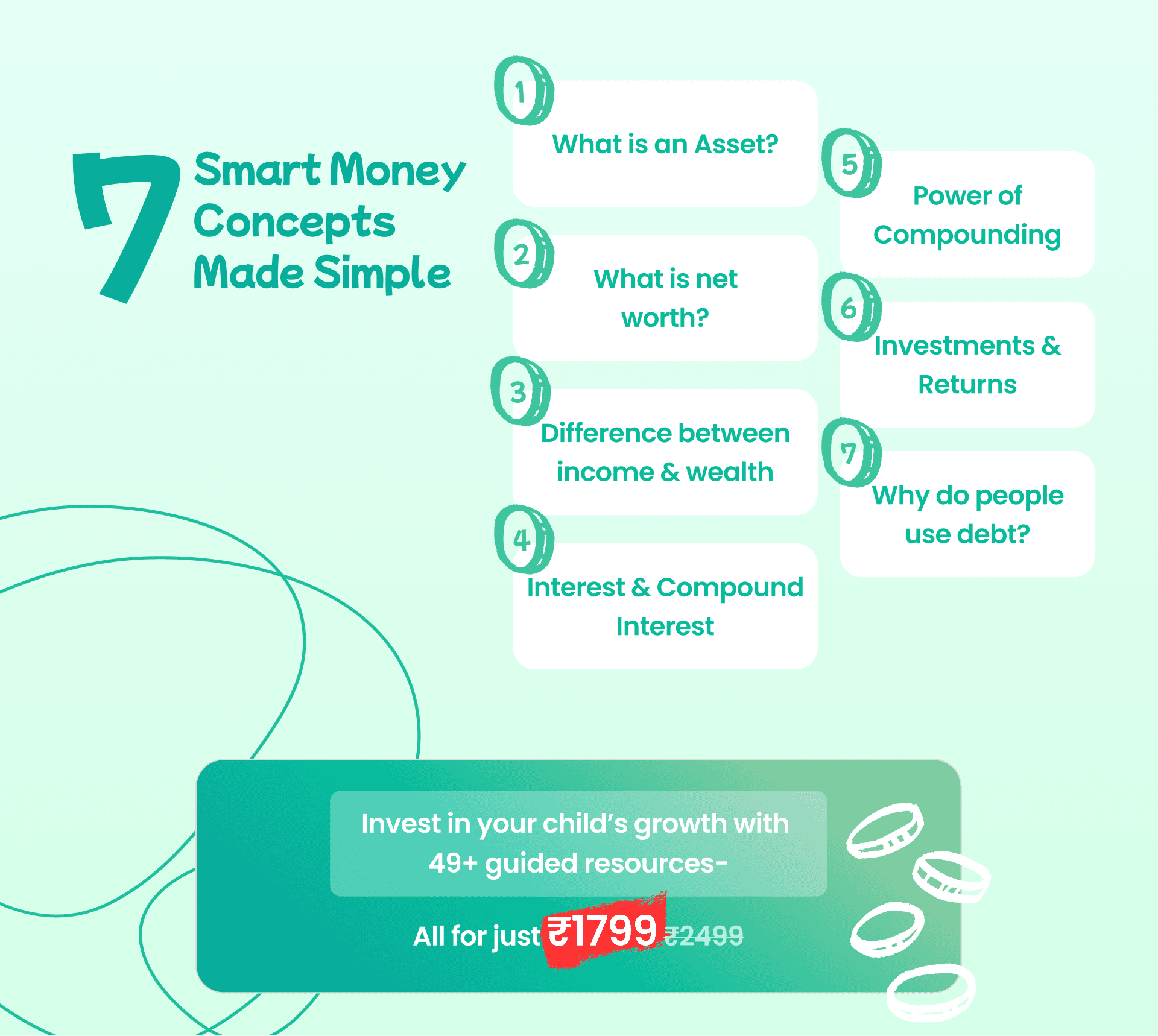
Self-Help Kit Summary
Goal: Showcase product value clearly
Design Move:
Used modular cards with kit contents, benefits, and pricing psychology (₹1799 vs ₹2499) to drive conversions without needing long sales copy.
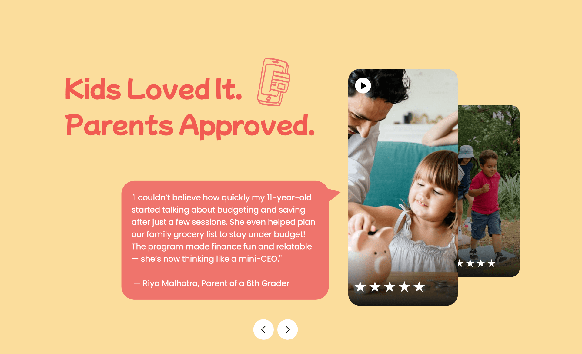
Parent Testimonials
Goal: Build emotional and social proof
Design Move:
Placed real parent quotes and success stories in mid-scroll to reinforce trust before the final CTA—critical for parents deciding whether to book a session.
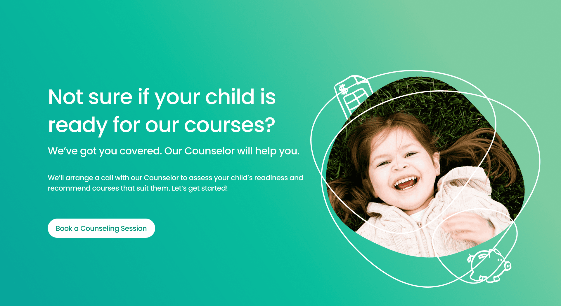
Final Call-to-Action
Goal: Nudge high-intent users toward booking
Design Move:
Closed the page with a low-friction CTA (“Book a session”) using a Google Form link, making it easy to act without signing up for anything.
Want to explore the full live experience?
Visit the full site here